June employment update for Spokane County
July 24, 2013 Leave a comment

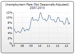
A broader look at historical employment. This older chart was created from US BLS data and within the resolution of the chart, is still accurate. As you can see, employment is about where it was in the boom years of 1998-2000.

(See update to this section, at bottom of this post)
Since 1998-2000, the population of the county has gone up a lot and this is not reflected in the unemployment # unless many people have left the workforce. Here is a chart showing population (red line at top, from US Census data or Census estimates), and average non-farm employed for the year (blue line at bottom, from WA ESD).

Converting this to a sort-of labor force participation rate (this not quite the same as that but conveys similar information) we see that about 4 percent of the population dropped out of the labor force since 2007-2008. If all them re-entered tomorrow looking for work, the real unemployment rate would be much higher (note – the 4% is not completely accurate since it used total population, not just working age, in the calculation).


Same chart as above, but “zero” based – unemployment remains stubbornly high. We are seeing just under a 1/2 percentile point improvement year over year rather than a more typical 1+ percentile YoY improvement.
An explanation for the annual summer jump in unemployment is, I was told, that local school districts put a lot of their non-teaching staff on 9 or 10 month annual contracts. Then lay them off each summer so they can collect unemployment insurance, then rehire them in the fall. I have no idea if this is true. The State combines health care and education categories into one so all we can see is this one giant category – but every summer the total # employed in this category follows the same pattern. Losing around 1500 jobs is about 0.7 percentile points of the unemployment rate.

Update With the Actual Labor Force Participation Rate Data
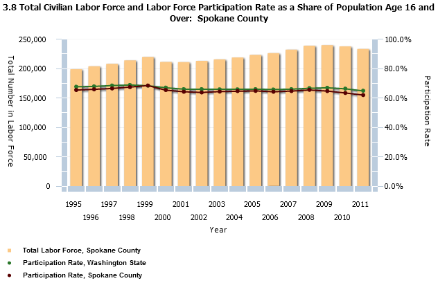
Here’s the data on Spokane County labor force participation. Labor force participation peaked in 1999 at 68.5%. From 2000 to 2011, the rate went from 65.38% to 61.97%, or a drop of 3.4%. This chart is from the Community Indicators of Spokane web site – Spokane is the dark red line. What is shows is that 3.4% of workers dropped out of the labor force.

You must be logged in to post a comment.